Welcome to my UI/UX work!
come have a look...
CONTENTS:

Scantrust Photo Authentication Service
July 2023
Overview
Last summer, Scantrust aimed to expand its online mobile Photo Authentication Service to accommodate a new type of QR code on the graphics and webpages of the app. This project was focused on not only updating the service's animation and graphics, but also improving the UI/UX of the report page.
For this project, I was in charge of redesigning the report page upon user error and updating the animation displayed on the webpage to increase user success with taking a picture of a viable QR code for validation.
Photo Authentication Service:
Report Page Redesign
the steps I took...
01.
Problem
02.
Research on other apps' approaches
03.
Ideation
04.
Design
01. Problem
Upon failing to verify a QR code, users are led to a report page that warns them of their potential counterfeit product and lists potential reasons for this error.
However, upon talking with my lead designer, she expressed her dissatisfaction with the design.
We both agreed that the current report page's left a lot to be desired. Its problems were that:
-
it was not in line with Scantrust's brand image
-
it lacked a clear visual hierarchy, with potentially more text than necessary and a design that felt cluttered

02. Researching Different App Approaches
Before I began redesigning, I wanted to study the designs of other apps' error pages.


Studying Airbnb:

I browsed online for examples of error pages and found Airbnb's. There were a lot of things that I loved about its design.


Studying Uber
Similar to Airbnb, I noticed that Uber utilized a similar visual hierarchy in establishing the error
and context for the error.
First, they grab our attention with a header indicating an error. Then, they further contextualize this error in smaller text before providing the user a way to exit and remedy their actions.
What I noticed the most...
-
Page follows clear visual hierarchy, top-down, that effectively communicates to viewer the problem that occurred and steps to solve it
-
Aim to contextualize what went wrong to user to prevent future errors
-
Provide user with possible steps to exit page and take action
With these in mind, I was ready to brainstorm how to reimplement our report page
03. Ideation
Upon researching how other apps approach correcting user action in their report pages, I set out to brainstorm potential ways I could reimplement our report page.
Through my design bootcamp and coursework, I learned about the Crazy 8's exercise to jumpstart solutions.

Studying my very crude (haha) initial ideas, I noticed I placed an emphasis on establishing a clear visual hierarchy, with a large header at the top.
This was to establish immediately to the user that something was wrong and needed fixing.
Next, I often included a smaller section of text. In my mind, this was to provide additional context about what error just occurred to the user.
Lastly, I ended with a button to exit the current page and try to fix the error.
Wireframing

Header to alert users of error
Accompanying visual
Additional context
Exit button to fix action
Using what I gravitated towards in my Crazy 8's sketches, I set out to create a low-fidelity wireframe that
captured three main qualities: visual hierarchy, additional context, and a way to take action.
04. Design
Upon creating the wireframe, I moved on to Figma, where I
was able to create visual prototype for the new design.
Throughout the process, I learned how important establishing
a visual hierarchy is for a webpage. My design on the right
immediately alerts the user that an error has occurred. Then,
I contextualize that error, as studied from other error pages.
Finally, I end with the page with calls to action to minimize
the amount of time the user spends on the page and to fix their
problem.

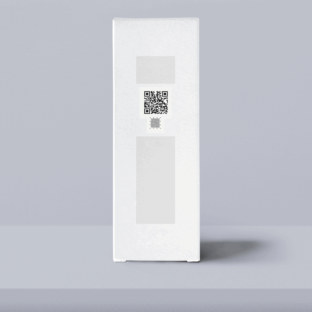
Photo Authentication Service:
Secure Graphic Outside QR Code Animation
Starting Out: QR Animation
To guide users how to properly take a valid photo for QR authentication, we provided them with an animation detailing the process.
We found that users did not read the full instructions for taking the photo found in the right video, so this animation was key in improving the experience of the app.
During the summer, Scantrust started to test
their new type of QR codes, with the secure graphic on the outside, thus, updating this animation was crucial.


Secure Graphic (SG) on the outside
Process
Using Photoshop, I had to tweak the QR code to look as similar as possible to the regular one in the old animation. This required blending and filling to match the lighting of the background.


With the graphic created, I took to Keynote and replaced the base images with the new QR code. However, this caused problems within the animation. I then had to reanimate the frames to match the old GIF.